The homepage, loan guides, country pages, lender pages and the blog each looked like a different site.

Website design case study · Education loans, India
Fund Abroad’s site already ranked, so we redesigned all 333 pages without moving the things search engines read. Every page kept its address, title, description and content. What changed is how it looks, how you find your way around it and how fast it loads: the homepage now requests 35 files where it requested 136.
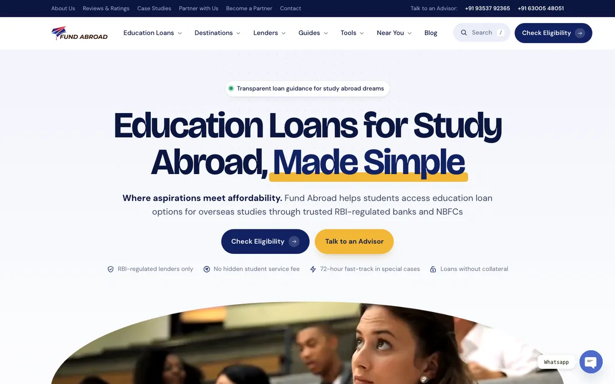
The new fundabroad.com homepage, launched October 2026.
The client and the challenge
Fund Abroad helps Indian students pay for study abroad, comparing education loan offers across 16+ RBI-regulated banks and NBFCs. It is based in Hyderabad and serves students across India.
We had already run Fund Abroad’s performance marketing. By October 2026 the site had grown to 333 pages: loan guides, country and lender pages, 39 state and city pages, tools and a blog. The pages ranked. The brief was to give all of them one modern design and leave every word and link where it was.
The homepage, loan guides, country pages, lender pages and the blog each looked like a different site.
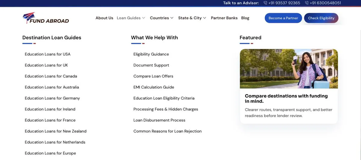
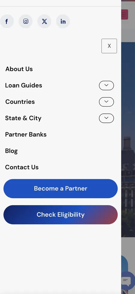
Six top-level items, long lists under Loan Guides, and no home for the tools or lenders.
The homepage alone ran 123 separate entrance effects.
The homepage requested 136 files and took 6.9 seconds to show its main content on desktop.
Titles, descriptions, H1s, URLs and internal links were already working in search, so all of them had to stay.
Our approach
We could add anything and delete nothing. So the new design wraps the existing content in new components, and every addition gives students a faster way to the page they need.
Bricolage Grotesque headings, DM Sans text, deep navy with a marigold accent, and an arch that frames the photos and film on every template
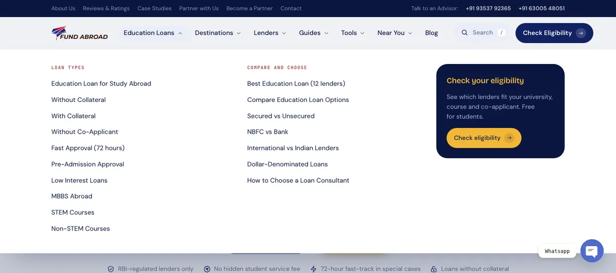
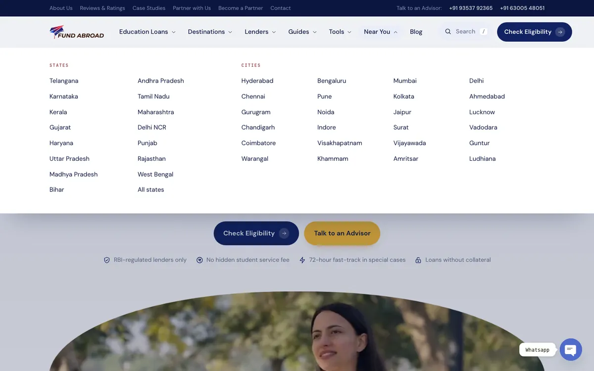
Seven groups (Education Loans, Destinations, Lenders, Guides, Tools, Near You and Blog), with a utility bar for About, Reviews, Case Studies, partners and Contact
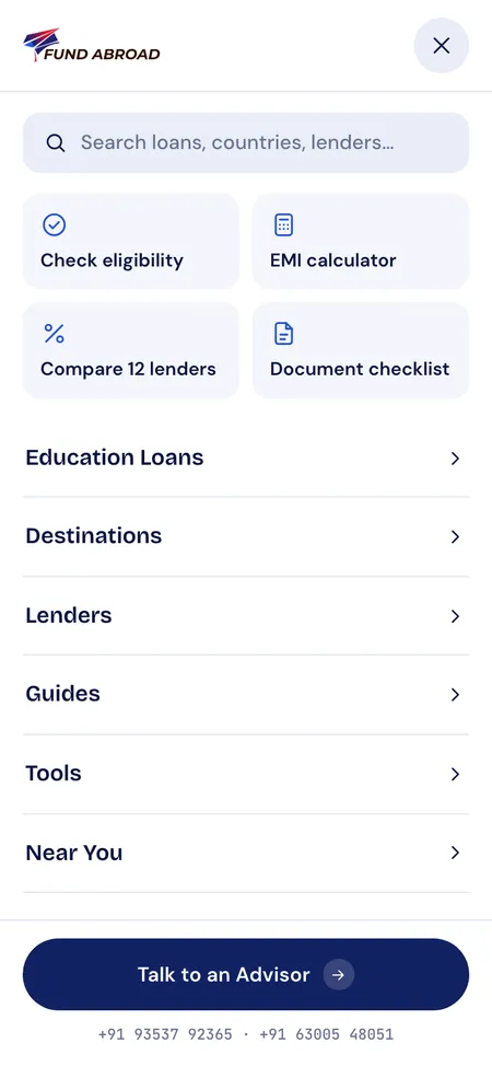
A search box in the header and the phone menu finds any page as you type, misspelt words included
A sticky bar on every page jumps to each section and highlights the one you are reading
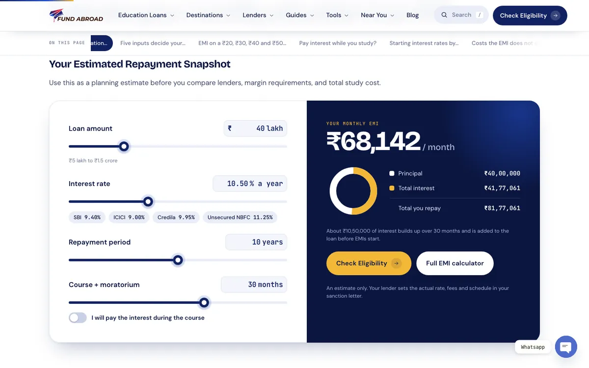
Monthly EMI, total interest and total payable update as the sliders move
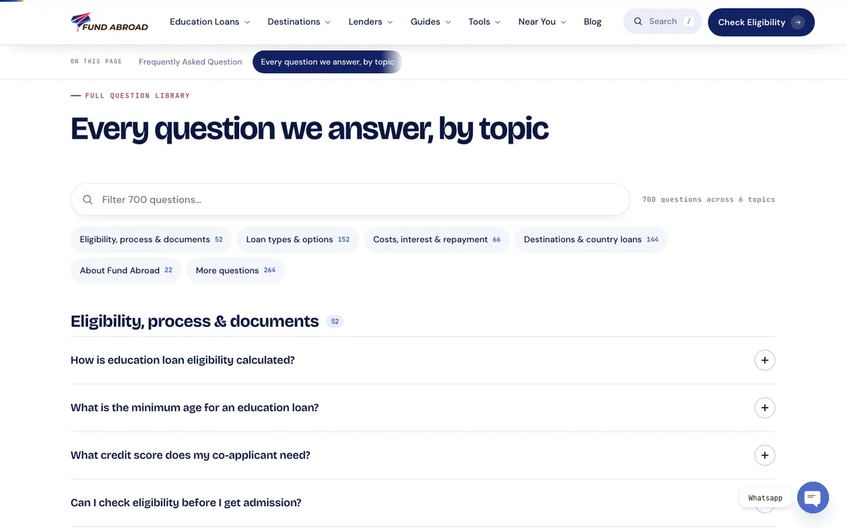
The FAQs from every page, grouped into six topics and filtered as you type
One reveal style in place of 123 separate effects, and all of it off for visitors who ask their device for less motion
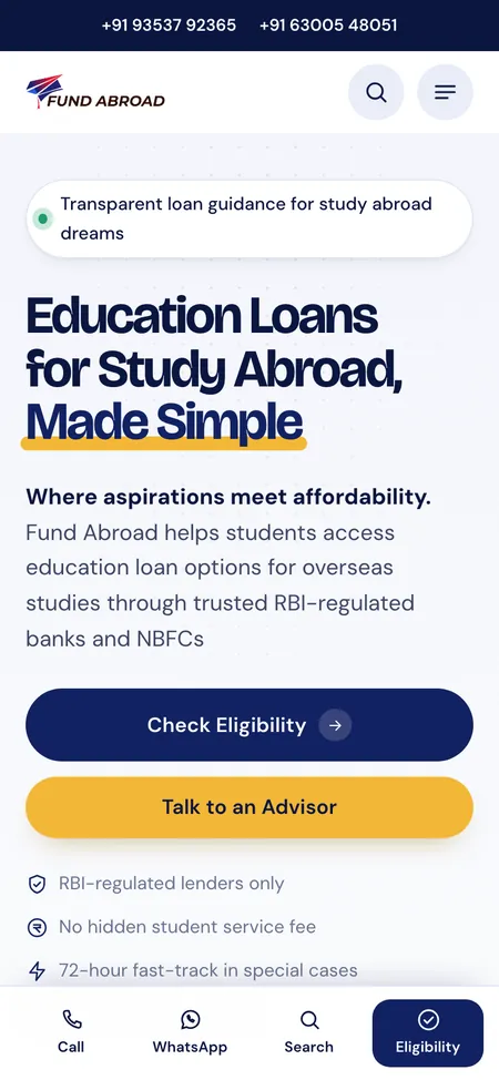
Full-width buttons, and a bottom bar that keeps Call, WhatsApp, Search and Eligibility one tap away
The 15 state and 24 city pages come from a separate regions plugin. The new design sits on top of its markup, so the plugin works exactly as before.
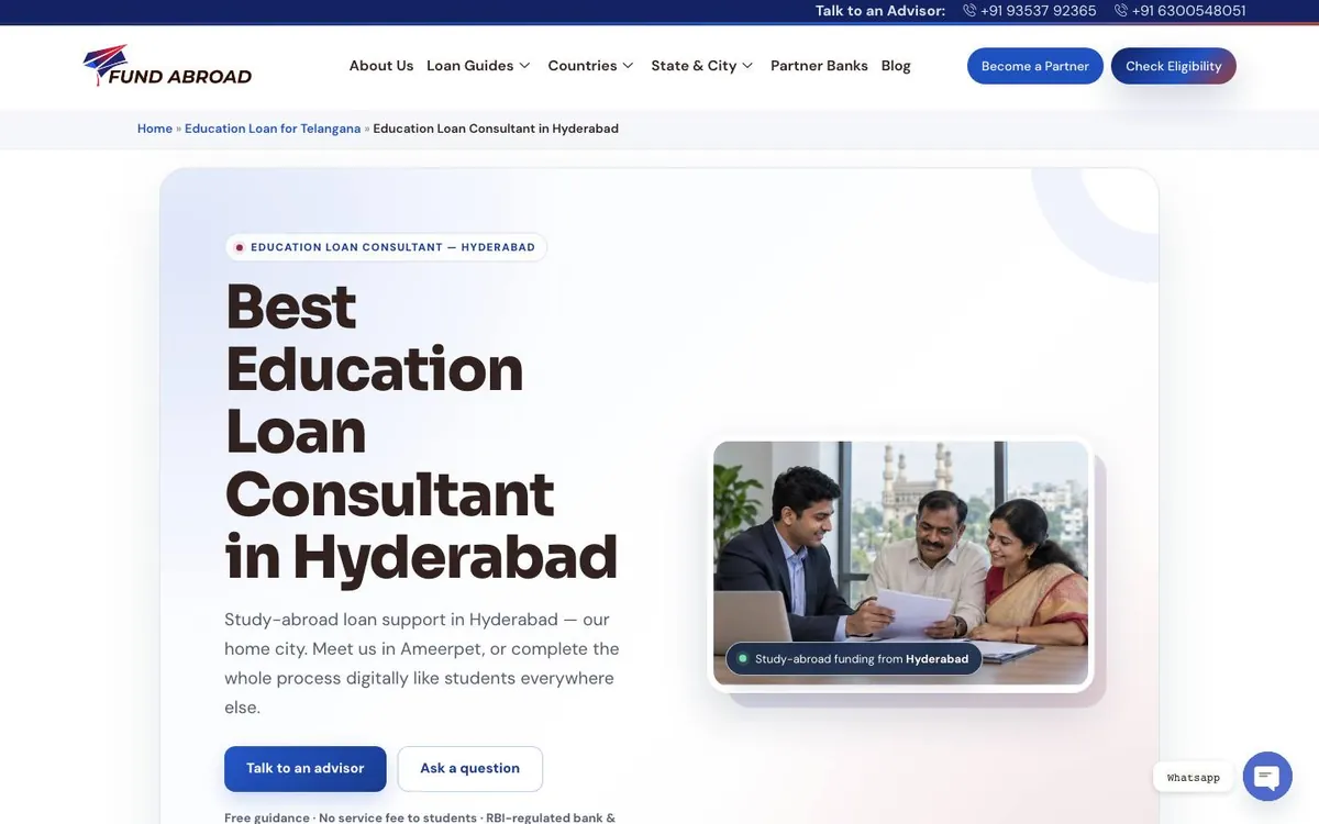
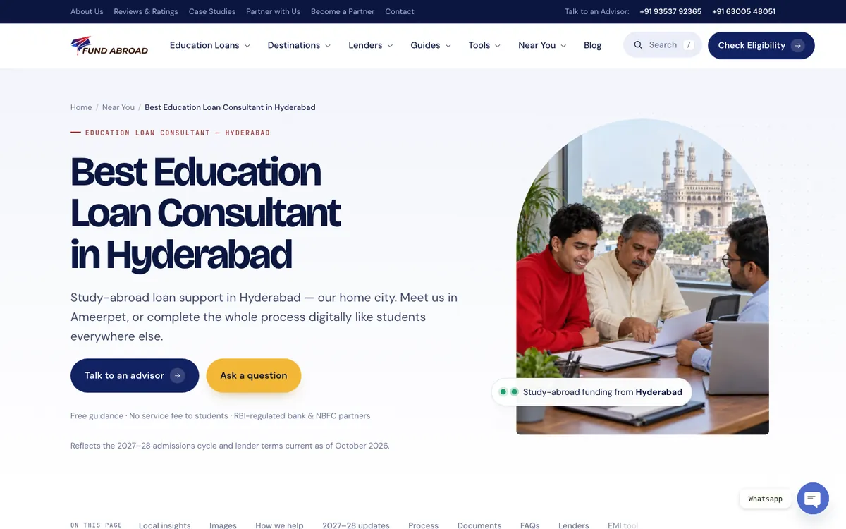
Homepage, before and after
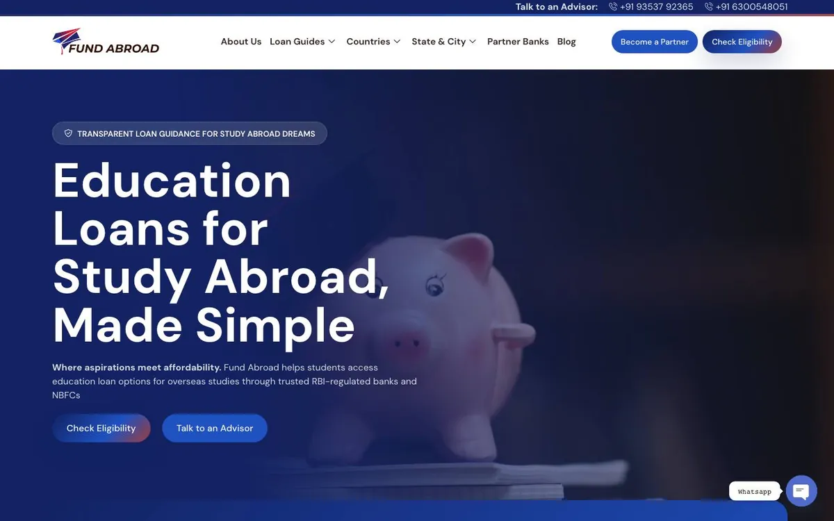
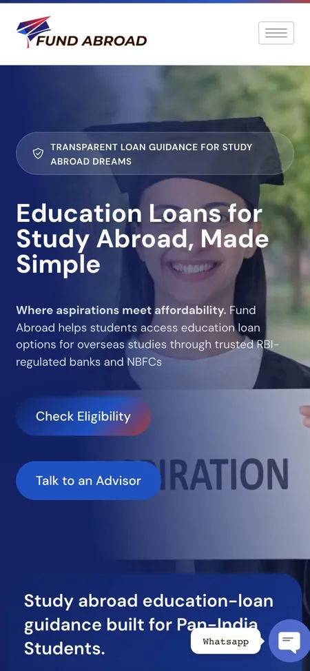
The headline, intro and buttons are word for word what they were. Around them: a light background in place of the dark photo, four trust points under the buttons, search in the header, and the brand film opening inside the arch as you scroll.
Navigation, before and after
Every link from the old menu is still in the new one. Each page now has one obvious home, and on a phone the menu opens on search and four shortcuts: eligibility, the EMI calculator, lender comparison and the document checklist.
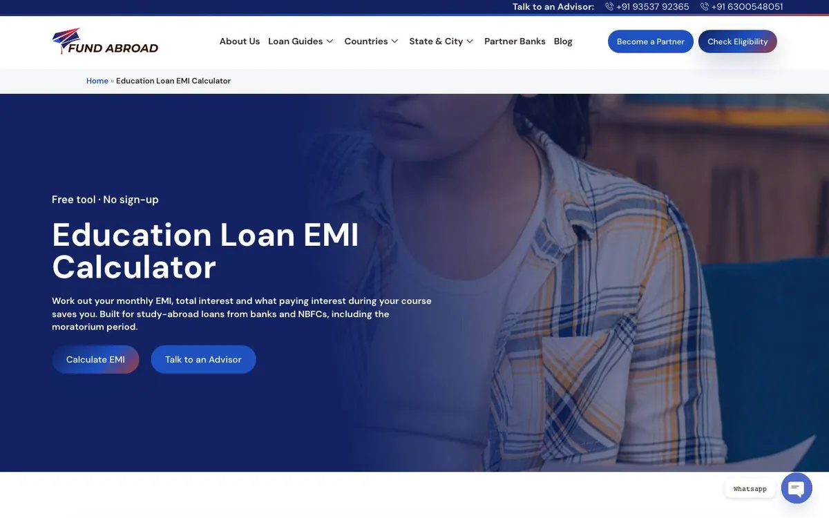
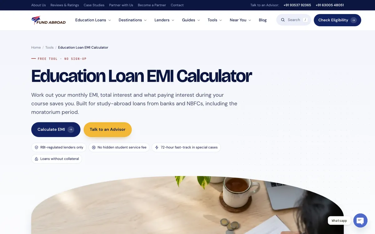
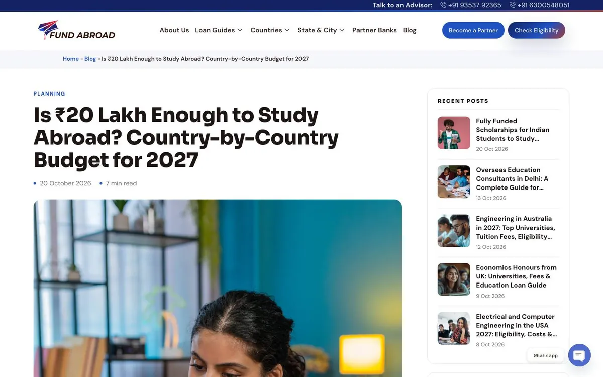
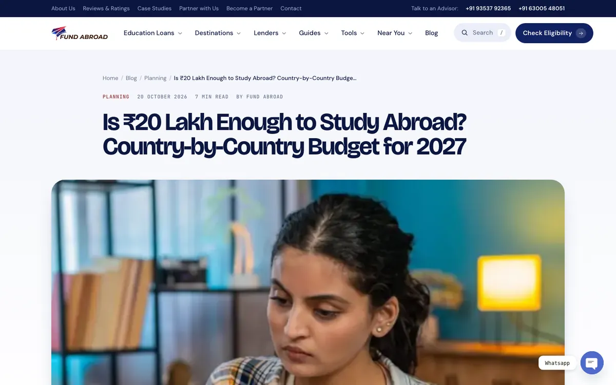
Inside pages, before and after
Country, lender, city, tool and blog pages share the same parts: a breadcrumb, a clear next step, a photo in the arch and the On this page bar.
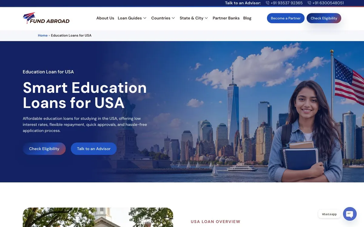
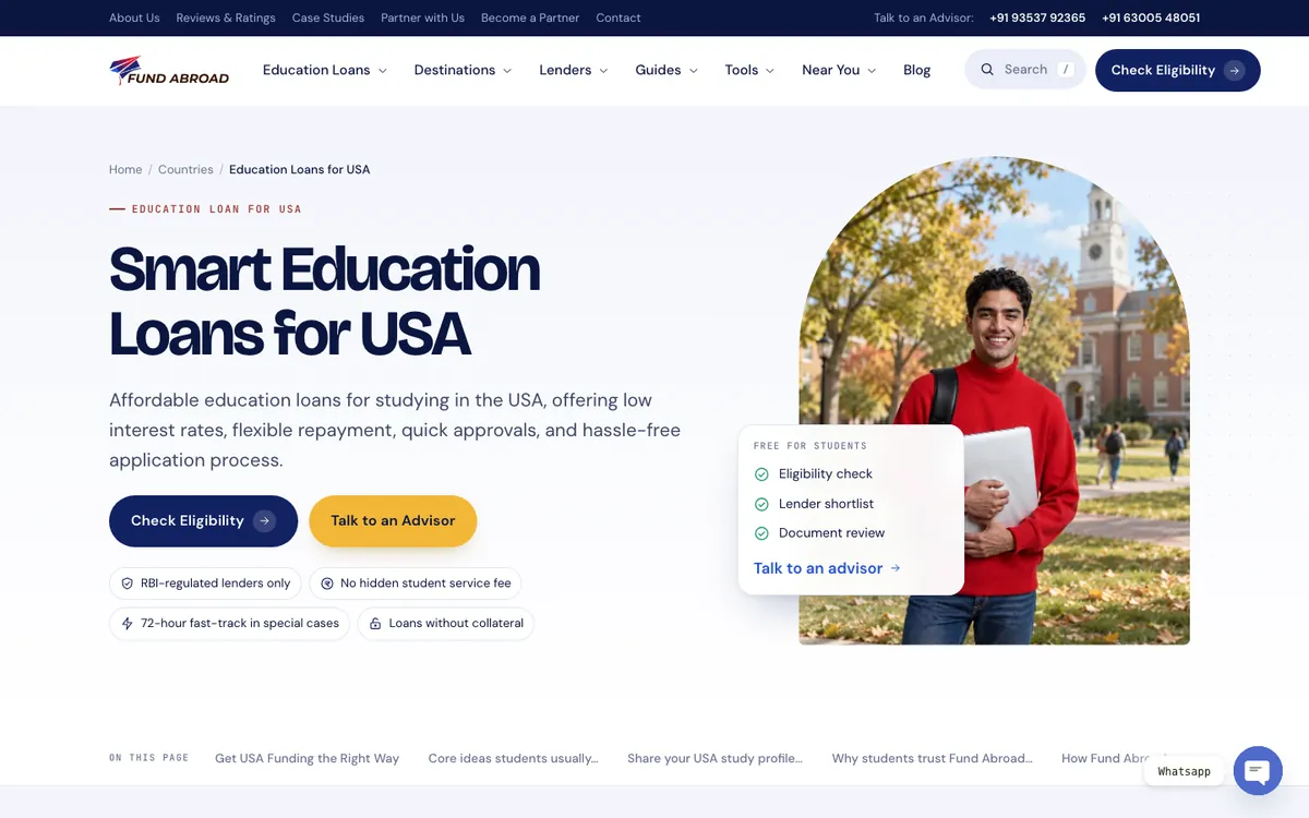
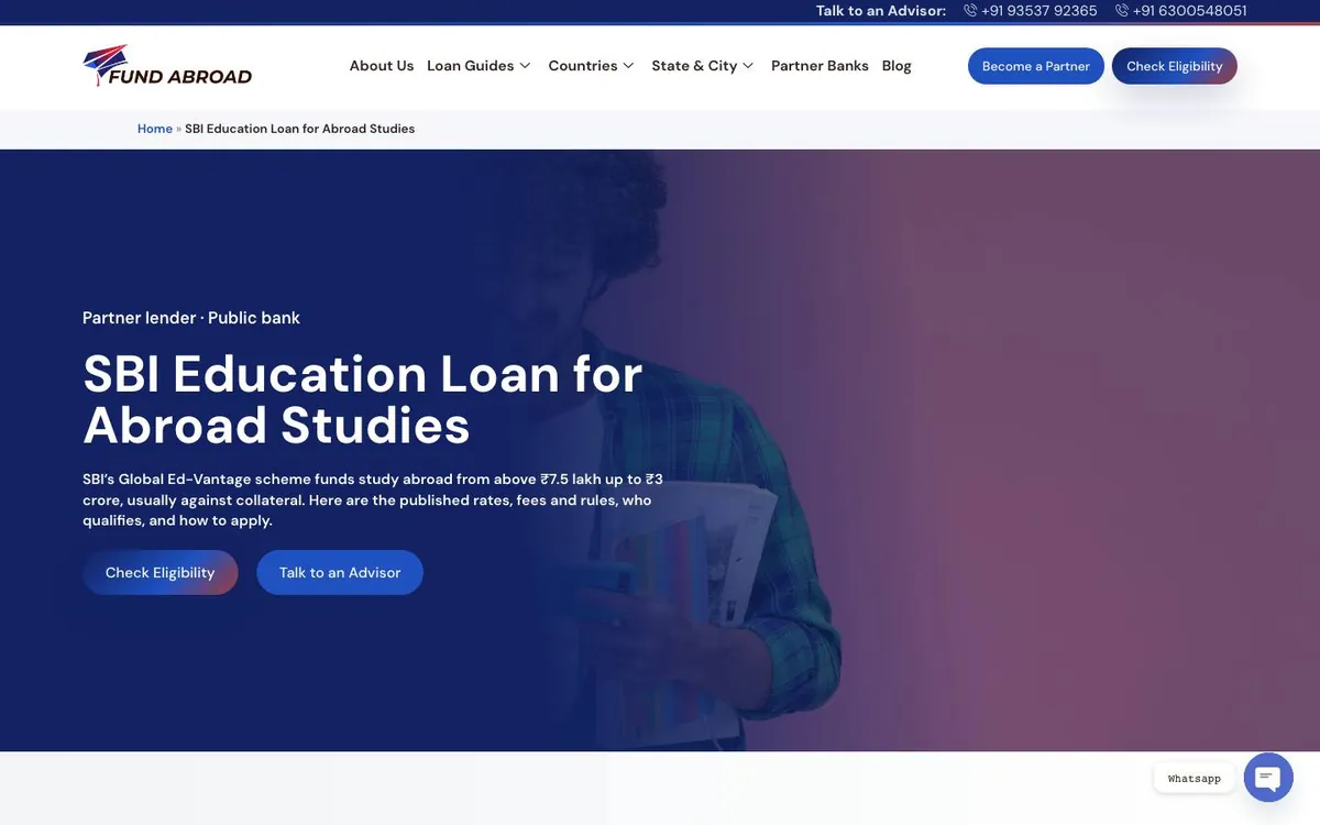
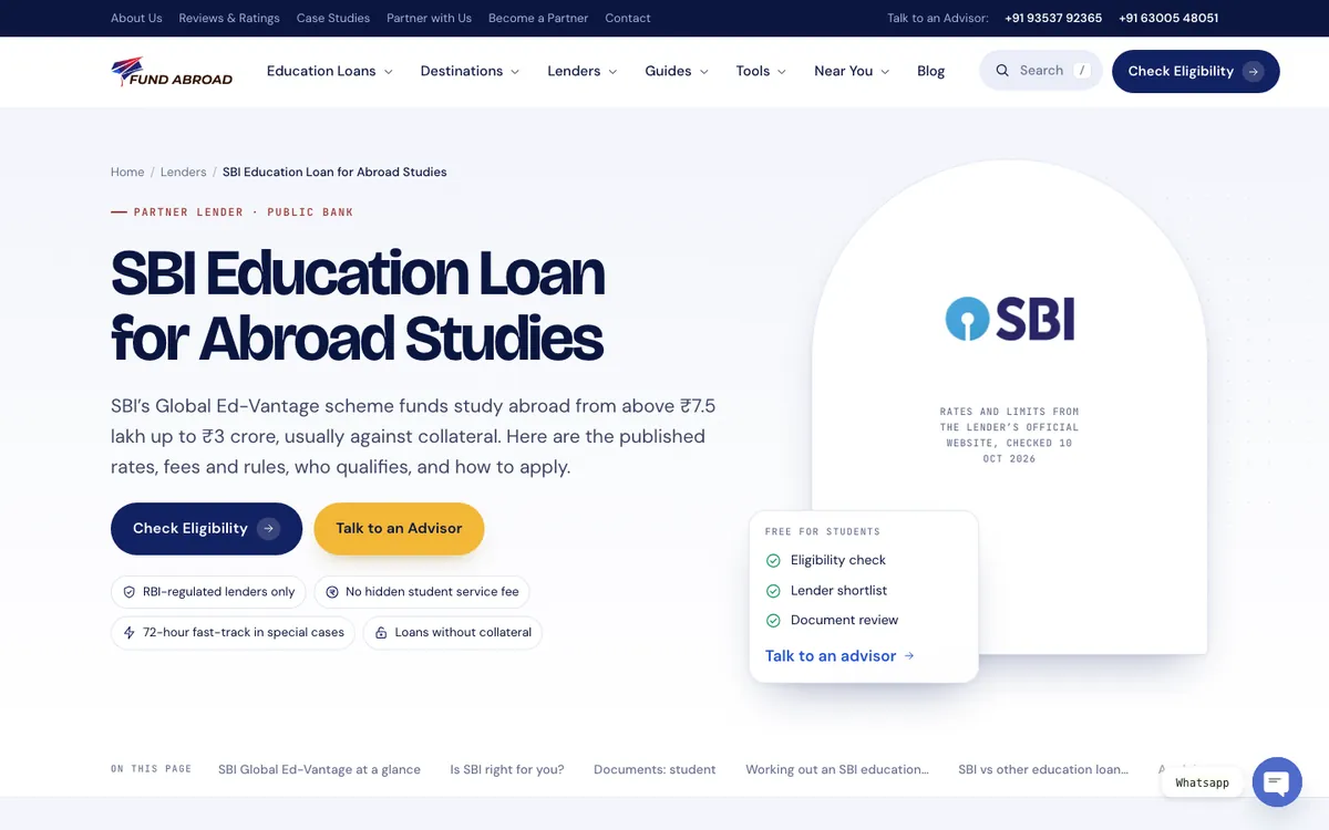
Design highlights
Work out a monthly EMI, search every answer on the site in one place, and reach any state or city page from the menu.
Results
An automatic check compared every page text and link with the old site: none missing. Across eight sample pages, the files each page requests fell from an average of 88 to 32, and the time to show the main content from 3.0 to 1.4 seconds.
| Before | After | |
|---|---|---|
| Pages in the new design | 333, in several styles | 333, in one design |
| Page texts and blog sentences missing | — | 0 of 6,330 texts and 3,605 sentences |
| Internal links lost | — | 0, across pages, header and footer |
| Copy fixes | — | 152 approved fixes on 29 pages, each logged |
| Main menu | 6 items | 7 groups, search and a utility bar |
| Footer | 70 links | All 70, plus 15 states and 24 cities |
| Homepage files requested | 136 | 35 |
| Homepage main content on screen | 6.9 s | 1.3 s |
| Average files per page, 8 sample pages | 88 | 32 |
| Average main content time, 8 sample pages | 3.0 s | 1.4 s |
Speed: one desktop load per page in Chrome, the old site on 21 October 2026 and the live site on 24 October 2026. Main content time is Largest Contentful Paint. Sample pages: homepage, USA, SBI, without collateral, Hyderabad, EMI calculator, a blog post and the FAQ.
Credits
We wrote up how we redesigned a site this size without losing anything: how we redesigned a 333-page education loan website, before and after →
FAQs
We redesigned all 333 pages in one design and built it into the existing WordPress site: UX and UI design, motion, a mega menu, site search, an On this page bar, an EMI calculator and a 700-question FAQ directory. The new design went live in October 2026.
No page address, title or meta description changed. All 6,330 page texts and 3,605 blog sentences were kept. The only wording changes were 152 copy fixes Fund Abroad approved, each logged before and after.
The homepage now requests 35 files instead of 136 and shows its main content in 1.3 seconds instead of 6.9. Across eight sample pages, the average time fell from 3.0 to 1.4 seconds. Each figure is one desktop load in Chrome.
Before launch, every page was tested on desktop and mobile for script errors, failed files, sideways scrolling, missing alt text and a single H1. After the switch, every public page was compared with a copy saved before launch for its title, description, canonical, H1, schema, analytics and forms.
Our websites start at ₹1,00,000 plus GST, with B2B sites from ₹1,75,000 and corporate sites from ₹2,25,000. A large redesign is priced on the number of pages and templates to move and check.
Redesigning a site that already ranks?
We will tell you what to keep, what the new design should lead with, and how we would check that nothing goes missing.
Awarded Digital Marketing Agency
4.8 from 250+
 reviews


