Alert: DIGISTREET does not offer any jobs via WhatsApp. Such messages are fraudulent. Apply only through official channels. Stay mindful. Stay safe.

Website design case study · Author website, USA

Managing Fear website redesign for author Stan Popovich

We turned a text-heavy WordPress site into a calm, modern home for Stan’s book, A Layman’s Guide to Managing Fear. Every word of his content stayed. The 15 pages and 56 articles now share one design, and the homepage loads 3 style and script files where it used to load 47.

Visual identityUX and UI designMotion designFront-end buildSEO setup
Managing Fear website redesign case study: the new bookbystanley.com homepage on desktop with one promise, the book cover and two buttons

The new bookbystanley.com homepage, launched October 2026.

71Pages redesigned: 15 site pages and all 56 articles
47 → 3Homepage style and script files, 977 KB down to 77 KB
13 → 28Reviews on show, filterable by counselors and readers
October 2026Launched at bookbystanley.com

The client and the challenge

A practical author with a lot to show.

Stan Popovich is a Penn State graduate from Pittsburgh who has lived with anxiety for more than 20 years. His book, A Layman’s Guide to Managing Fear, offers 200+ practical strategies, has 400+ Amazon reviews and has taken him onto 30+ US TV and radio programmes, including ABC, CBS, FOX and NBC stations.

His old site, managingfear.com, held years of good writing. The design did not show it off. We rebuilt it as a calm, modern home for the book, and it is now live at bookbystanley.com.

Text first, story second

Visitors had to read before they understood the offer. The homepage opened with four paragraphs and a stock photo.

The book was hard to see

There was no cover on the homepage, and the order page led with a long headline and an FAQ.

A dated look

A busy top bar, heavy serif headings and an eight-item menu.

Built for desktop

On phones, every section collapsed into one long column.

Heavy

The homepage loaded 47 separate style and script files.

Our approach

Keep every word, change how it is shown.

We kept all of Stan’s content and redesigned how it is presented, so a worried visitor feels calmer within seconds and knows where to start.

01

Calm, on-brand colour

One soothing blue (#2C5EAD) taken from Stan’s own brand, with white space and pale-blue sections and no competing colours

02

Clear, modern type

Poppins headlines with Inter body text, sized for easy reading on any screen

03

A new identity

The Managing Fear wave-and-sun logo, used across the header, footer and browser tab

04

Story-led homepage

The problem (three short videos), the solution (the book and a free 5-step framework), then proof (Stan, media, reviews)

05

Real people, real proof

Photos of Stan at work, the book cover in 3D, and logos of ABC, CBS, FOX, NBC, MSN and iHeartRadio

06

Gentle motion

Words that rise into place, steps that light up as you scroll and a photo that wipes from fear to family life, all switched off for visitors who prefer less motion

07

Phone-first layout

Two columns wherever content fits, a sticky Get the Book bar, and swipeable video and topic rows

08

Easier reading

Every article has a quick-answer box, a table of contents that follows you down the page, and related reads

Each of the 69 old page addresses has a permanent (301) redirect to its new page.

Homepage, before and after

A wall of text became one clear promise.

The new homepage leads with one promise, the book and two clear buttons. The old one led with a wall of text.
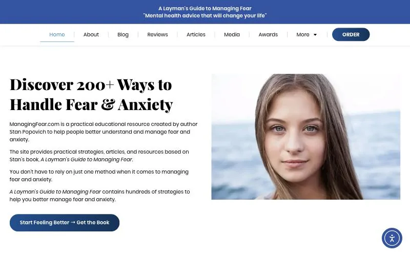

BeforeManaging Fear website redesign case study: the old managingfear.com homepage on desktop, opening with four paragraphs and a stock photo
Managing Fear, beforeThe old managingfear.com homepage opened with four paragraphs and a stock photo.
AfterManaging Fear website redesign case study: the new bookbystanley.com homepage on desktop with one promise, the book cover and two buttons
Managing Fear, afterOne promise, the book and two clear buttons on bookbystanley.com.

On a phone

BeforeManaging Fear website redesign case study: the old managingfear.com homepage on a phone
Managing Fear, beforeOn a phone, every section fell into one long column.
AfterManaging Fear website redesign case study: the new bookbystanley.com homepage on a phone
Managing Fear, afterThe phone layout keeps the promise and the book in the first screen.

Inside pages, before and after

Every page got the same treatment.

A clear headline, a visual on the right, and the next step one click away.
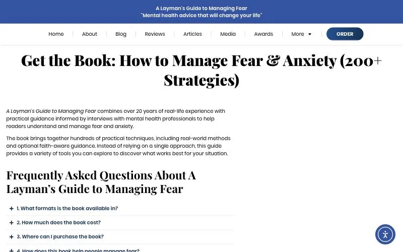
The book page

BeforeManaging Fear website redesign case study: the old Get the Book page with a long title and no cover in sight
Managing Fear, beforeA long title, then an FAQ, and no cover in sight.
AfterManaging Fear website redesign case study: the new Get the Book page with the 3D cover, the price and five ways to buy
Managing Fear, afterThe 3D cover, the price and five ways to buy at the top.

About Stan

BeforeManaging Fear website redesign case study: the old About page with a title and dense paragraphs
Managing Fear, beforeA page title and dense paragraphs.
AfterManaging Fear website redesign case study: the new About page with Stan Popovich's portrait, his story in one line and his credentials
Managing Fear, afterStan’s portrait, his story in one line and his credentials.

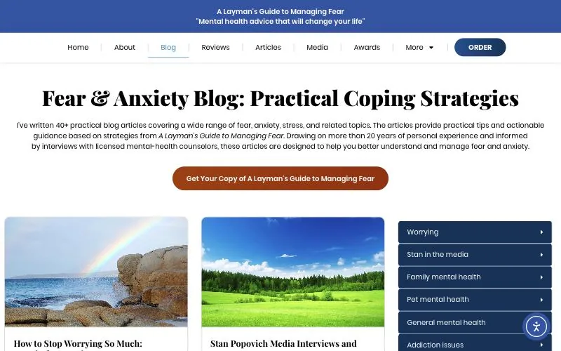
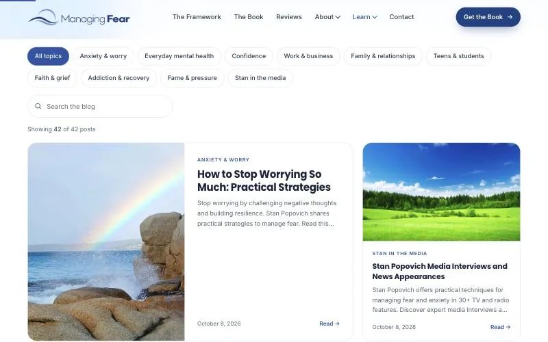
The blog

BeforeManaging Fear website redesign case study: the old blog page, a card list beside a long category sidebar
Managing Fear, beforeA card list beside a long category sidebar.
AfterManaging Fear website redesign case study: the new blog page with topic filters and search above a card grid
Managing Fear, afterTopic filters and search above a clean card grid.

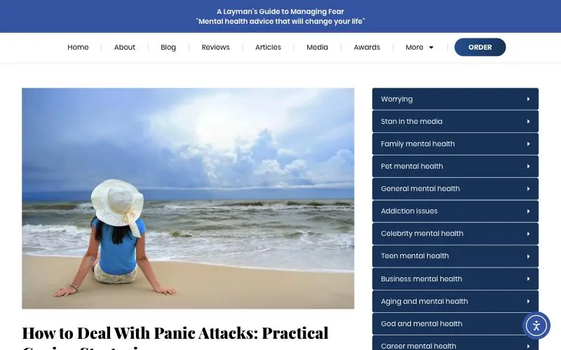
An article

BeforeManaging Fear website redesign case study: an old article page with a large photo beside a long category sidebar
Managing Fear, beforeA large photo beside a long sidebar of categories.
AfterManaging Fear website redesign case study: a new article page with a quick-answer box and a table of contents
Managing Fear, afterA quick answer up top and a table of contents that tracks your place.

Design highlights

Three moments that carry the story.

Three new sections carry the homepage’s story, from recognising the fear to seeing life beyond it.

Managing Fear website redesign case study: the Does this feel familiar section with three short video tiles
“Does this feel familiar?”Managing Fear homepage. Three short, silent video loops show worry, panic and racing thoughts, so visitors see themselves before they read a word.
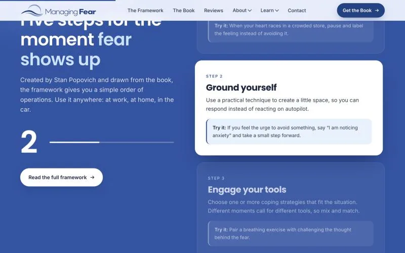
Managing Fear website redesign case study: the 5-step Managing Fear Framework lighting up step by step on scroll
The 5-step frameworkManaging Fear homepage. Stan’s free method became an interactive guide. Each step lights up as you scroll, with a real-life example.
Managing Fear website redesign case study: a scroll reveal ending on a laughing family
From fear to lifeManaging Fear homepage. As you scroll, a frightened face wipes away to a laughing family, with the line “Fear may still show up. It doesn’t have to run your life.”

Results

A lighter site that carries all of it.

All of Stan’s content now sits in one design: 71 pages, with about 13 times less style and script code on the homepage (977 KB down to 77 KB).

BeforeAfter
Pages in the new design—71 (15 pages and all 56 articles)
Homepage HTML312 KB54 KB
Homepage style and script files47 files, 977 KB3 files, 77 KB
Reviews shown on the reviews page1328, filterable by counselors and readers
Media appearances shownText lists19 TV and 27 radio appearances as cards, plus 64 publications with links
Search-ready markupHomepage basicsBook, FAQ, how-to, author and article data on every page

Page weights measured in the browser on 24 October 2026, excluding photos and videos on both sites.

Credits

Who did what.

We wrote up the decisions behind this project for anyone planning a similar site: what an author website redesign should change, and what it should keep →

Client
Stan Popovich, author of A Layman’s Guide to Managing Fear, Pittsburgh, PA
Scope
Visual identity refresh, UX and UI design, motion design, front-end build, migration of 56 articles, SEO setup
Launched
October 2026
Design and development
DigiStreet Media

FAQs

About this project.

What did DigiStreet Media do on the Managing Fear website?

We refreshed the visual identity, designed the UX and UI, added the motion design, built the front end, moved all 56 articles into the new design and set up the SEO. The site went live in October 2026 at bookbystanley.com.

Was any of Stan Popovich’s content removed in the redesign?

No. We kept every word of Stan’s content and changed how it is presented. All 15 site pages and all 56 articles carry the new design, 71 pages in total.

How much lighter is the new homepage?

The homepage HTML went from 312 KB to 54 KB, and its style and script files from 47 files and 977 KB to 3 files and 77 KB. Both sites were measured in the browser on 24 October 2026, without photos and videos.

Does the motion get in the way for anxious visitors?

No. The motion is gentle, and all of it switches off for visitors whose device is set to reduce motion.

Does DigiStreet Media build websites for clients in the USA?

Yes. Stan Popovich is based in Pittsburgh, Pennsylvania, and we designed and built his site from India. Websites for US clients start at $1,450, priced in US dollars with no GST.

Sitting on years of good content?

Send us the site.

We will tell you what to keep, what to move and what the new design should lead with.

Get a quote →

Awarded Digital Marketing Agency
Over 100 5 star rating reviews

Let’s Imagine, Believe, Create Together

    Select Services*

      Select Services*